Joan Semmel’s (Born 1932 in New York) Erotic Series (or “fuck paintings”) of the 1970s, subsequent nude self-portraits, and recent unflinching depictions of her aging body establish her as one of the most important feminist painters of her generation. Over a fifty-year career, Semmel has practiced a radically self-possessed painterly project concerned with charged eroticism and frank, corporeal self-portraiture. Her practice has presciently combined photography’s unique subject/artist relationship and image cropping with painting’s viscous material capacity to describe and emulate flesh. In the 1970s, her work constituted a near-singular painterly investigation into desire and heterosexual sex from a woman’s vantage point.
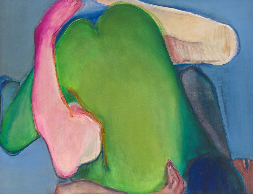
In many ways, Green Heart is a key work in the development of the artist’s oeuvre. From 1963 to 1970, while living in Spain and South America, Semmel explored the potential of form, color, and composition in an abstract expressionist idiom. Moving back to New York in 1970, she began to bring her expressionist approach to the depiction of female and male figures tangled together in erotic embrace. In preparation for Green Heart, as with all paintings of the subject, Semmel asked a couple to have sex while she photographed them from above. Images of sex, so often depicted from a male perspective—whether for overtly pornographic purposes or with greater prurience in the high art context—are in Semmel’s work reconfigured from her perspective as a woman witnessing, capturing, and interpreting the act.
Semmel’s near-decade of experience with abstract painting informs Green Heart’s urgent paint handling, expressive color, and push-and-pull composition. Immediately compelling for its subject and formal decisions such as cropping and frontality, Green Heart shows the direction her paintings would take in the 1970s: carefully descriptive, cool, colorful depictions of sex and naked bodies, sourced by the disembodied camera, but reinterpreted in paint by the artist.